Documentation
Hello, welcome to Arloji theme's documentation!
The following is a general overview of the theme's features. More detailed explanations for the theme's customization options are available in the Theme Settings area of the theme.
Header
Logo
You can upload your own logo to be displayed on the header area. The area is flexible enough to handle various logo size, but the maximum size will be 1170 pixels wide and 400 pixels high (that would be a rather curiously wide logo, though). If your own logo is not yet ready, the theme will display your shop's name as a text instead. The theme will allow you to choose various display fonts for the text.
Main navigation
The navigation also allows for dropdown menu.Follow this instruction to do so. This automatically uses the "Main Menu" navigation already provided by Shopify. Any changes you apply to it will automatically be reflected on the site.
Design and Typography
There are various ways you can tweak Arloji's design and typography:
Homepage
The homepage area of Arloji contains a lot of customization options. Most of them pretty awesome, too!
Sliders
Sliders are a great way to showcase new products, or deals, or what-have-you. You can have up to 5 slider images, although it is advisable if you don't use all of that up. Your visitors' attention will be greater if you have enough, but not too much, slider images.
The (highly) suggested image size for the slider images is 1170 pixels wide by 520 pixels high.
Mobile Sliders
Arloji is a responsive theme, so by default your slider images will be resized down when viewed on mobile devices. However, we highly suggest you create and upload alternative mobile sliders as well. The reasons are:
- The mobile slider image dimension is more suitable for mobile screens. On the other hand, the regular slider might be too small / squished when scaled down.
- The mobile slider images, being smaller, will be faster to load on mobile slider. Mobile visitors are usually on a slower and more limited bandwidth speed, so they will surely appreciate this!
The (highly) suggested image size for the mobile slider images is 480 pixels wide by 320 pixels high, and will be displayed on devices with maximum of 480 pixels wide resolution (think iPhones in landscape mode).
Featured Products
You can select one collection to display in this area.
From the Blog Area
If you have written two or more blog posts, it's a good idea to activate this area. It will show your most recent posts in two columns.
Our Brands Area
You can use this optional area to showcase the logos of the brands you carry. You will need to use an image editing program to create a composite image of the logos to be displayed here. The maximum width for the image is 1170 pixels.
Collection Pages
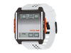
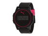
Arloji theme allows you to set how many products you want to display per page, and whether you want to display a simple tag navigation dropdown or not. This page will use a product's main image for its display grid.
Product Pages
On the product page, you can toggle vendor name on/off, as well as whether you want to display related products or not. The theme will automatically add easy sharing option via:
- Google+
- Tumblr
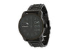
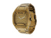
Finally, the product page also has an automatic product gallery with thumbnail and zoom feature, you only need to upload your product images and it will take care of everything!
Blog, Article and 'Page' Pages
Yes, 'Page' pages. Clunky, we know. These three type of pages display a sidebar that you can customize on the Theme Settings. On the sidebar, you can display:
- Customer login form (handy!)
- Tags (blog article tags, not product tags)
- Collection listing
- A custom navigation links (which you can create in the backend and then choose in the Theme Settings)
- Lastly, an automatically added RSS feed.
Footer
The footer area contains four different columns with various functionalities in each. They are:
About Us
This is basically a free text area. You can write anything here. A good idea is to write your shop's quick info: email, phone number, and so on.
From Our Blog
This area automatically displays the latest posts from your blog.
Products of the Day
You select a collection for this area, and then it will display the thumbnail image of the products.
Latest Tweet and Newsletter Subscription
Does your shop have a Twitter account? If yes, you can display its latest tweet here. There's also a newsletter subscription option, which can either use Mailchimp or Shopify's built-in e-mail capture feature.
Footer Navigation
This automatically uses the "Footer" navigation already provided by Shopify. Any changes you apply to it will automatically be reflected on the site.